 technology
  No Comments
 Pretty graphic, bad data.
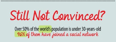
I’ve been meaning to post about this for awhile, but earlier this summer a colleague was tweeting from a conference about social media, and this infographic came up: Still Think Social Media is a Fad? One of the ‘facts’ she tweeted was that “50% of the world’s population is under 30. 96% of them have joined a social network.”

(highlighting above is mine, and not part of the graphic.)
That immediately piqued my attention, because, really? 96% of the WORLD’s population under 30 is using social media? Even the ones fighting to survive in Darfur, or those in remote villages in South America? You can’t toss around a “world” statistic and get such great results.
I asked for the source of the info, and was led to the blogpost above, and if you look at the complete graphic, it only lists generic websites: “facebook.com, linkedin.com,” etc — and not actual published data. Antennae start to wiggle on my head. This is the kind of stuff that I warn my students to watch out for, and this graphic is getting praise?
I asked on the creators site via the comments where the info came from.
That “world’s population” stat is really, really bad data. Where is that statistic from? According to this site:http://www.internetworldstats.com/stats.htm less than 29% of the world’s population has internet access, so saying that 96% of the world’s population under 30 (which, also, insinuates birth-30) is connected to a social network (and in this graphic it’s implied it’s one online, not a general human social network) is just really, really bad data, and it makes me question all other statistics on the graphic. It’s pretty, but one bad number makes me doubt the rest.
The author, Angela Neilsen, responded with:
Hi Mark and Gretchen – thanks for the comments. The stat about the under 30 I got from the video produced by SocialNomics.net (http://www.socialnomics.net/2010/05/05/social-media-revolution-2-refresh/), of which on the same page they quoted their sources as well.
As for full urls Gretchen – thanks for pointing that out. I had originally put in the long urls to the specific pages, but at completion removed them as I didn’t think people would want to type that much data. In addition, so many times pages get moved within a domain, or renamed, that I didn’t want to make people think they were bad pages if that happened. But it’s still certainly a great point and I’ll keep that in mind for future infographics.
With that link, I was able to dig deeper:
Thanks for the link — the video source has misrepresented the statistic — yes, 50% of the world’s population is under 30, but the 96% stat was based on a national survey of 1227 US kids between 9-17, and that was in October 2006, so the juxtaposition here and in the video is really, really apples vs oranges.http://www.trendsspotting.com/blog/?p=165 (When I talk about deep links, the video site is providing what I like to see when people are using stats to back their point http://www.socialnomics.net/2010/05/05/social-media-revolution-2-refresh/ )
Social media is awesome, it’s not a fad, but any critical thinker should immediately question that “96% of the world” stat. “50% of the world’s population is under 30! 100% of them claim ice cream is their favorite food!”(Oh, but for ‘them’ I meant the people that live in my house…..)
And, well, that was the end of the conversation. The graphic wasn’t changed. The posts weren’t updated to show that it was really, really poor use of data, it wasn’t even acknowledged in the comments that well, I was right! And I love to be right.
The graphic is all over the internet now:
http://visual.ly/still-think-social-media-fad
http://www.uniquevisitor.net/still-think-social-media-is-a-fad
http://jeffthomastech.com/blog/?p=10410
And I’m kind of amazed that more people aren’t questioning the numbers, and that the author hasn’t edited the graphic or provided an addendum. But hey! It provides a great example of how to think critically about infographics and statistics in general, so it’s a great teaching tool for that!